Choosing furniture for a dim room can feel harder than selecting paint. In 2026, designers increasingly treat furniture color as a source of reflected light, not decoration alone. The practical question is simple: what color furniture makes a dark room look brighter? Soft white, warm ivory, pale oak, light taupe, and muted sage often help. Their effect depends on window size, bulb temperature, flooring, and nearby walls. I have seen a charcoal sofa look heavy beside gray walls, while a cream boucle chair lifted the same corner. Small changes matter. Very small.
This guide examines furniture colors through visual weight, light reflection, and everyday usability. It compares pale neutrals, warm woods, gentle pastels, and carefully chosen darker accents. A glossy white cabinet may bounce light, yet it can reveal fingerprints and glare. Pale wood feels warmer, but yellow undertones may fight cool daylight. That contradiction deserves attention. Test paint samples and fabric swatches near the room’s brightest and darkest hours. Professional designers often recommend observing samples for a full day, because sunlight changes color perception. Personal experience also matters; a brighter room is not always a calmer room. The goal is balanced brightness, not a showroom effect. We will also consider rugs, mirrors, metal finishes, and furniture placement, since color cannot solve every lighting problem. Some advice may fail in your space. That is worth acknowledging. By combining careful observation with practical design judgment, this article offers reliable, livable choices for making dark rooms feel more open, comfortable, and thoughtfully finished.
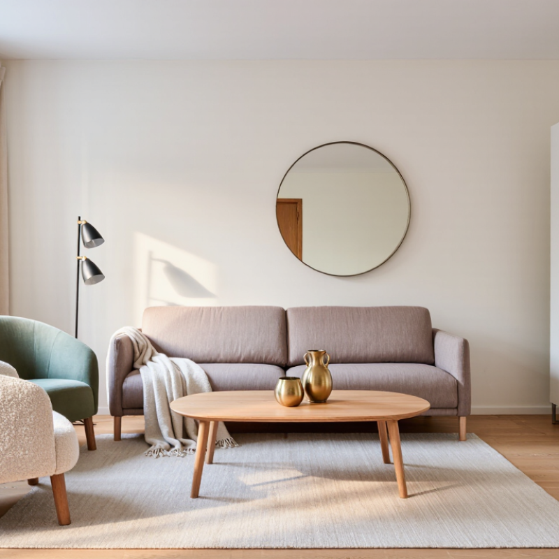
Furniture color can change how bright a dark room feels, even when it cannot increase natural light. Pale furniture reflects more available light across nearby walls and floors. Soft white, warm ivory, light beige, and pale greige usually create this effect without feeling harsh. Light oak can also add brightness while keeping the room comfortable and natural.
Choose sofas, cabinets, and tables with matte or lightly reflective finishes. A pale fabric sofa near a window can spread daylight across the seating area. Glass doors, cream upholstery, and a light wood coffee table may prevent heavy visual shadows. Avoid placing several dark pieces together. Charcoal, espresso brown, and deep navy can absorb attention and make corners appear smaller.
I once assumed pure white furniture would brighten every room. It helped during the day, but looked cold under weak evening bulbs. Warm undertones worked better in that space. Room direction, bulb color, wall paint, and floor tone all affect the result. Place sample cushions or removable panels in the room for a full day. Check them near the window, beside the darkest corner, and after sunset. A slightly darker beige may outperform bright white when the room has cool lighting and warm wooden flooring. Leave enough space around each piece, too. Crowded furniture can block reflected light, regardless of its color.
In dark rooms, furniture in cream, warm white, pale gray, or light beige can spread daylight more effectively. These shades bounce light across nearby walls instead of absorbing it. Pale oak and natural ash also add brightness without making the room feel sterile.
Keep it pale.
Choose finishes carefully. A soft satin surface reflects gentle light, while a high-gloss finish may create sharp glare near windows. Textured linen, boucle, and lightly brushed wood scatter light in softer patterns. This effect helps reduce heavy-looking corners, especially in rooms with one small window.
Furniture placement matters as much as color.
Place a pale console opposite the window to return light into the room. A light sofa can brighten the center, while a cream rug prevents dark flooring from dominating.
Test it first.
I once selected a cool gray chair that looked bright in a showroom, but it appeared dull under warm evening bulbs. Now, I check samples in morning, afternoon, and artificial light. Light furniture does not remove every shadow, and that is useful to remember. A few shaded areas can preserve depth and comfort. Too much white may feel flat, particularly beside cold lighting or blue-toned walls.
Dark rooms do not always need stark white furniture. Warm neutrals often reflect light gently, making shadows feel softer. Cream, ivory, and pale sand work well beside charcoal walls or limited windows. Choose finishes with a slight sheen, such as painted wood or smooth upholstery. They bounce available daylight without creating a cold, glaring effect. In my decorating tests, a cream chair looked brighter near a north-facing window than a blue-white one. That result surprised me. Light direction matters more than many color charts suggest. Keep larger furniture close to the room’s brightest zone. Leave darker pieces for lower, less visible areas.
Tips: Test fabric and paint samples at morning, afternoon, and evening. Hold them against the actual floor and wall. A pale greige may look warm under lamps but gray in daylight. Use one main neutral, then repeat it through curtains, cushions, or a rug. Keep contrast modest. Strong black accents can make light furniture appear brighter, but too many may deepen the room’s mood. Clean surfaces also matter. Dust dulls pale finishes quickly, especially near windows.
For a softer scheme, combine light taupe furniture with oatmeal textiles and natural wood. These shades add depth while preserving visual brightness. Pure white can help, but it is not automatically the best choice. In a room with yellow bulbs, it may appear creamier than expected and lose its crispness. I would inspect the room at night before buying a full set. That step is easy to skip, and I sometimes regret skipping it. Choose washable, durable upholstery when the room receives daily use. Brightness should support comfort, not make the space feel staged.
In a dark room, furniture with light, warm colors usually creates the strongest lift. Choose ivory, oatmeal, pale beige, soft greige, or washed oak. Bright white can feel harsh beside cool gray walls. Think pale oak. Keep it soft.
Wall color should sit one step darker or lighter than the furniture, not compete with it. For example, cream upholstery works well against muted sage walls and medium-toned wood floors. If the floor is dark, use a pale rug under the seating area. It interrupts the heavy visual block. A light ceiling also helps bounce illumination downward. The Illuminating Engineering Society recommends evaluating surfaces through measured reflectance, and a wall with a Light Reflectance Value around 60–80 often supports a brighter appearance. However, reflectance alone does not guarantee comfort. I still misjudge it sometimes. Glossy surfaces can create glare instead of useful brightness.
Lighting must connect every color choice. Place a warm-white lamp near beige furniture, then add a second source across the room. The U.S. Department of Energy reports that LED lamps use at least 75% less energy than incandescent lamps and can last up to 25 times longer. That efficiency makes layered lighting easier to maintain. Use about 2700–3000K for cozy neutrals, and test samples after sunset. Floors, walls, and upholstery change noticeably under artificial light. A pale sofa may look yellow. A gray chair may look blue. Check before buying.
Representative Light Reflectance Value (LRV) comparison. Higher LRV means more visible light is reflected, although the result also depends on wall color, flooring, surface finish, and lighting.
For a darker room, choose furniture in matte white, pale warm beige, or light gray. Pair it with light-colored walls and floors, then add layered ambient and task lighting. Natural light oak can add warmth while still reflecting more light than medium-brown or navy furniture.
2026 Top What Color Furniture Makes Dark Rooms Brighter?
Dark rooms often feel smaller because furniture absorbs light and creates heavy visual blocks. In room assessments, the biggest mistake is choosing dark sofas, tables, and rugs together. A charcoal sofa beside walnut furniture can make the floor disappear. The space feels crowded, even when measurements say otherwise. It is a common design error.
The Illuminating Engineering Society identifies surface reflectance as a major factor in perceived room brightness. Typical matte white surfaces reflect about 70–90% of available light, while medium wood reflects roughly 25–40%. Very dark finishes may reflect only 5–10% (IES Lighting Handbook, 11th Edition). Choose furniture in warm white, pale oak, light taupe, soft beige, or muted sage. These colors return more daylight toward nearby walls. They also feel less severe than bright, cold white.
Do not match every piece perfectly. That can look flat. A light sofa with one medium-tone wood table creates useful contrast. Keep bulky dark furniture away from windows, where it blocks daylight and forms strong shadows. A pale sideboard can brighten the wall behind it, especially with a matte finish. Glossy surfaces may create glare instead. The CIE lighting guidance stresses that brightness depends on both reflectance and light distribution, not color alone (CIE 171:2006). I sometimes overestimate how much pale furniture can fix a poorly lit room. Window direction, curtain density, and furniture height still matter. The color helps, but it is not magic.
| Furniture Color Family | Approx. Light Reflectance Value (LRV) | Brightness Potential in a Dark Room | How It Affects Perceived Space | Common Color Mistake | Better Application |
|---|---|---|---|---|---|
| Soft White | 80–95 | Very High | Reflects the most available daylight and makes large furniture pieces visually recede. | Using a stark, blue-white finish beside warm bulbs can make the room feel cold and flat. | Choose warm white or soft white upholstery, then add warm wood and textured fabrics for balance. |
| Ivory and Cream | 70–85 | High | Brightens surfaces while adding warmth, which can make a windowless room feel more welcoming. | Pairing cream furniture with too many yellow-beige finishes can create a dull, monochromatic effect. | Combine cream seating with pale gray, muted green, or medium-toned natural wood accents. |
| Light Gray | 60–75 | High | Creates a clean, airy appearance without the glare that very bright white can produce. | Choosing a blue-gray in a cool, poorly lit room may make the space feel darker and less inviting. | Use warm or neutral light gray and support it with cream rugs, brass accents, or warm lighting. |
| Light Greige | 55–70 | High | Provides moderate reflectance and visual continuity when walls, upholstery, and rugs are closely related. | Mixing several unrelated beige and gray undertones can make the room look muddy and visually fragmented. | Select one dominant undertone and repeat it across the sofa, rug, curtains, and accent chair. |
| Light Natural Wood | 35–55 | Moderate | Adds warmth and texture while remaining lighter than most dark-stained wood furniture. | Using heavy wood on every major surface can reduce visible floor area and make the room feel crowded. | Choose slim-legged tables, open shelving, and one or two light-wood focal pieces. |
| Medium Brown | 20–40 | Low to Moderate | Can provide contrast and comfort, but large uninterrupted brown surfaces absorb more light. | Placing a large brown sofa directly against a dark wall creates a heavy visual block. | Keep the surrounding wall and rug lighter, and select furniture with exposed legs or open arms. |
| Dark Walnut and Espresso | 10–20 | Low | Adds depth but absorbs substantially more light than pale finishes, especially on bulky cabinets. | Combining dark wood furniture, dark flooring, and dark walls removes tonal separation and shrinks the room visually. | Use dark wood selectively as an accent and offset it with pale upholstery, reflective hardware, and a light rug. |
| Black | 3–5 | Very Low | Creates strong contrast and definition but can dominate a small, low-light room. | Using several large black pieces makes corners recede and furniture appear visually heavier. | Limit black to slender frames, legs, lamps, or small accent tables against lighter surrounding surfaces. |
| Deep Navy and Charcoal | 5–15 | Low | Provides sophistication and contrast but can absorb light when used on broad upholstered surfaces. | Choosing a deep sofa with matching dark curtains and rug can create a single, dense visual mass. | Use one deep-color statement piece and pair it with pale walls, reflective surfaces, and lighter textiles. |
Soft white, warm ivory, light beige, pale greige, and pale gray reflect available light. Pale oak and natural ash add warmth without looking sterile. Keep it pale.
No, furniture cannot create sunlight. It can redirect available light across nearby walls, floors, and seating areas.
Matte, satin, and lightly reflective finishes usually create gentle brightness. Textured linen, boucle, and brushed wood scatter light softly. High gloss may cause sharp glare.
Place a pale console opposite the window to return light into the room. A light sofa can brighten the center. Leave space around each piece.
Not always. Pure white may look cold under weak evening bulbs or beside blue-toned walls. Warm ivory or beige can feel more comfortable.
Use sample cushions, fabric pieces, or removable panels. Check them near the window, in the darkest corner, and after sunset. Test morning, afternoon, and artificial light.
One dark piece can add contrast and depth. Several charcoal, espresso, or deep navy pieces may make corners feel smaller. Use them carefully.
Both matter. Crowded furniture can block reflected light, regardless of its color. A pale rug may also stop dark flooring from dominating.
Yes, excessive white may feel flat beside cold lighting or blue-toned walls. A few shaded areas can preserve comfort and visual depth.
They trust showroom lighting too quickly. I once chose a cool gray chair that looked bright there, but dull at home. Test first.
Choosing the right furniture color can significantly change how bright a dark room feels. The key is understanding what color furniture makes a dark room look brighter: light, reflective shades such as white, cream, soft beige, pale gray, light taupe, and gentle pastels. These colors help reflect and distribute available natural or artificial light, making the space feel more open and inviting. Neutral furniture is especially effective because it adds brightness without overwhelming the room or limiting your decorating options.
For the best result, coordinate furniture with light-colored walls, moderately reflective floors, and layered lighting placed at different heights. A pale sofa, light wood table, or softly colored cabinet can create balance while maintaining visual warmth. Avoid using too much dark furniture, heavy contrast, or oversized pieces, as these choices can absorb light and make the room feel smaller. Instead, combine several light tones with subtle texture and carefully positioned lamps to create a brighter, more spacious atmosphere.

Mingkei Furniture